Pandas download statistics, PyPI and Google BigQuery - Daily downloads and downloads by latest version
Inspired by this blog post : https://langui.sh/2016/12/09/data-driven-decisions/, I wanted to play around with Google BigQuery myself. And the blog post is pretty awesome because it has sample queries. I mix and matched the examples mentioned on the blog post, intent on answering two questions -
1. How many people download the Pandas library on a daily basis? Actually, if you think about it, it's more of a question of how many times was the pandas library downloaded in a single day, because the same person could've downloaded multiple times. Or a bot could've.
This was just a fun first query/question.
2. What is the adoption rate of different versions of the Pandas library? You might have come across similar graphs which show the adoption rate of various versions of Windows.
Answering this question is actually important because the developers should have an idea of what the most popular versions are, see whether or not users are adopting new features/changes they provided in a new version, and so on.
https://bigquery.cloud.google.com/dataset/the-psf:pypi is where you can explore the metadata and enter/run the queries you are interested in.
Daily download stats
SELECT
  STRFTIME_UTC_USEC(timestamp, "%Y-%m-%d") AS yyyymmdd,
  COUNT(*) as total_downloads,
FROM
  TABLE_DATE_RANGE(
    [the-psf:pypi.downloads],
    DATE_ADD(CURRENT_TIMESTAMP(), -61, "day"),
    DATE_ADD(CURRENT_TIMESTAMP(), -1, "day")
  )
WHERE
  file.project = 'pandas'
GROUP BY
  yyyymmdd
ORDER BY
  total_downloads DESC
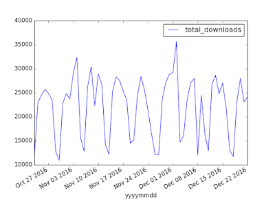
For those of you not familiar with the SQL-like syntax, the above query creates a new table which contains the dates in one column and the total number of downloads in the other. The download statistics pertain to the Pandas library. And we asked for 60 days worth of data.
After running the query, downloading the data set and plotting, you should see something similar to
If i'm not wrong, the regular dips are on the weekends. There are atleast two weeks which have strong dips mid-week. I haven't explored the dataset further but I wonder why.
Adoption rate of new updates/releases
The query is
SELECT
  STRFTIME_UTC_USEC(timestamp, "%Y-%m") AS yyyymm,
  file.version,
  COUNT(*) as total_downloads,
FROM
  TABLE_DATE_RANGE(
    [the-psf:pypi.downloads],
    DATE_ADD(CURRENT_TIMESTAMP(), -1, "year"),
    CURRENT_TIMESTAMP()
  )
WHERE
  file.project = 'pandas'
GROUP BY
  file.version,
  yyyymm
ORDER BY
  total_downloads DESC
LIMIT 1000
This time, the dataset contains one column pertaining to month, a second pertaining to the version of the Pandas and the third containing total downloads of a particular version of the library on a particular month. All in all, we ask for a full year's worth of download data i.e 12 rows, one for each month's cumulative.
Again, running the query, downloading the data and plotting it should give you something that looks like -
Actually. I lied. Directly plotting the dataset is going to look like a mess because there are a lot more versions than the 7 plotted above. I chose those 7 because they are the most recent versions. And, this too shows some interesting trends. It's interesting to note that Pandas 0.17.x and 0.18.x still have loyal/lazy users.
That's all for now. And I'm also being lazy by not posting the code-snippets I used to generate the plots from the data. But, I thought, this blog post would be a start so, I'll try to write a followup which links to the datasets and the code. Until then ...

